
The beginning paragraphs do not speak about data-visualisation even with the tones of sarcasm. If you are here only for the data visualisation, you can skip to the paragraphs which start after the separator below.
My primary goal in life (as of now) is to try and learn as many skills in Computer Science as possible before I finish college, to find a job in the same field. Because, the harshest truth I have faced in my life is the saddening potential in unconventional jobs for them to be financially safe. They are considered different for a reason. This does not mean I would consider anything related to my college to be ordinary. It might be true to the majority of dropouts, and I get that understanding quite vividly. I would be failing myself if I did as the majority would do when the system fails them. Because, considering college (or anything) as something ordinary/stupid just because you don’t like the normal is pretty much the single most intersection between a person and normality itself. Plus, I have always wanted to code.
This helps me in keeping up with the ones I need to be comparing myself to, for better outcomes a college education might have. After losing an academic year, I have learnt the art of comparing myself to others. It is quite simple. I do it regularly to myself the day before or the week before. Plus, to feel extremely better, just for the sake of it – the year before. This has proven to be progressive and positive regarding whatever the element of career competency one might consider.
If you see my Instagram, you will know that I love visuals and the message a visual can give. It was never my motive to work with visuals when I started to write screenplays, but the underlying fact that visuals are better than words has proved itself better for my creative process and also the screenplays. So, on my way to earn some certificates in Data Visualisation – I am also bettering my understanding of films and their making.
Remember, this won’t be as interesting as regular when I consider my original audience who like to read stories more than Computer Science terminologies. So, I will try to include as much of stupidity and love as possible. Let’s get right into the realm of amazing visuals, more like axial syllables!
Legend says that one can forgive a person for such rhymes.
That’s a separator. Awesome, let’s begin with the fact that I don’t know much about data-visualisation. So, consider this article only for dummies like me.
Note: If you find difficulty in understanding the images on your phone, try using a bigger screen. Otherwise, you can also open the images in a new tab.
ABOUT OUR DATA
John Hopkins School of Public Health has been updating the number of cases (confirmed, dead, recovered) along with other such related information (country/region, minimal description about the patient) on their data-set published to the online community of researchers looking for patterns in the outbreak, or even solutions to approach this virus. You too can have a look at this data-set by clicking here. It includes an interactive map as shown below.

SOURCE: JHU CSSE
The bubble for India might look small, but that number is 332. You can compare it to other bubbles nearby. For example, the one in Pakistan is representing a total of 773 confirmed cases, but a very slight increase in the size of the bubble. This is because of the scale being global.
We can barely see the bubbles of Nepal, Ethiopia and other poorly populated countries. Since the population is low, the combined foreign touch these countries might have had is drastically lower than that of India – hence, the virus resides in a smaller fraction in such countries. This hypothesis on foreign touch, can be furthermore confirmed looking at the map below:

SOURCE: JHU CSSE
WHAT I UNDERSTOOD
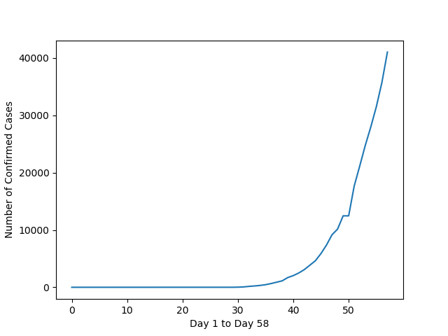
It is safe to say that the outbreak is increasing at a very high rate. It has been only two months since the virus became famous and the first confirmed case in India was reported on January 30th. In a period of only fifty days, you can see the increase in the outbreak in India:

Plots for a few other countries:


Italy, has unfortunately had the worst hit in confirmed cases based on the area of a country. Also, in the number of deaths. Italy, which I personally consider as the most beautiful country, was bound to have many travelers not just from around the world – but mainly the tourists in Europe.
The most interesting plot I could find was the one for Fiji. A country near Australia with over 300 islands. It is a beautiful tourist spot by the looks of it’s landscapes. Only, less traveled to. It recorded a second case just two days back.

I have completed the chapter on Line Plots, the most basic plot one can start with. So, for today we can say the virus is pretty quick at spreading itself and also that you need to stay at home. I have stayed at home for quite a remarkable time now, wishing to continue doing the same.
It is crucial that we all come together in flattening the curve and face this with an individual perspective when maintaining the social-distance. Learn to say no now, better than ever. Wash your hands like they could have the virus sleeping on them. And, know that viruses are barely a living entity. They just exist and replicate themselves unlike other living beings who also have to learn about viruses to survive.
#FlattenTheCurve
I am also doing a course on Natural Language Processing to try and contribute to CORD-19. About which, I highly doubt there will be any contribution at all considering my projects at college. Please share this article with your friends and family who’d like to create a reading habit while the holidays last. Happy reading!
My favourite source so far in getting to know about COVID-19: this video.
My previous post: Since ciphers sense stinkers!

Leave a comment